15 minutes
Analyzing Twitch Chat on Election Day
With election season in full swing, I thought it would be interesting to analyze and break down twitch.tv chat messages from election day. Thus, I’ve outlined steps taken for data exploration, while also identifying trends and commonalities within the dataset.
Disclaimer: I am not endorsing or opposing the content in this dataset. Please note that these messages have been posted by anonymous users who interacted on twitch.tv; therefore, they do not reflect my personal opinions. This post is solely focused on data exploration, looking for trends and commonalities, and presenting the data “as is.”
Background
Twitch is a video live streaming service operated by Twitch Interactive, which is a subsidiary of Amazon.com, Inc. So, how does it work? The broadcaster starts a live stream, and users tune into the live stream (i.e., channel) to view the broadcaster’s content. In this case, the content ranges from video games, YouTube videos, music performances, and so on. It is the broadcaster’s responsibility on what content they want to show. That said, what makes twitch.tv unique from YouTube and other social platforms is the chatroom, which provides real-time interaction between the broadcaster and users. For example, a user might join a live stream and type “What is your favorite game?” in chat. The broadcaster will read this question and then has the ability to reply verbally on the live stream. The chatroom also provides a sense of community, as it allows users to interact with each other when the live stream is offline.
The chatroom includes two unique features:
- Channel subscribers
- Channel emotes
Channel subscribers are users who sign up for a subscription plan (e.g., $4.99/month) to support a particular broadcaster of their choosing. Thus, channel subscribers have badges next to their name, which denote how long they’ve consecutively subscribed to a channel. Reasons for subscribing to a channel include access to exclusive channel emotes, which are unavailable to non-subscribers.
You can read more about channel subscribers here.
Channel emotes are emoticons that users can use to express their feelings. For example, the Kappa emote means sarcasm or wry humor. So, if a broadcaster makes a sarcastic joke, it is common to see users type Kappa in chat. For reference, there’s global emotes and 3rd party emotes as well (e.g., BetterTTV, FrankerFaceZ). They all have their own meaning and usage, and there’s an entire sub-culture to channel emotes that’s beyond the scope of this post.
You can read more about channel emotes here.
Method of Collection
The goal was to find the largest political twitch.tv channel, and Hasan Piker’s channel met those requirements. In the past, Hasan’s channel recorded over 100K concurrent viewers for the presidential and vice-presidential debates; therefore, I expected those numbers to increase on election day. According to sullygnome.com, Hasan’s channel peaked at 226,974 concurrent viewers, with an average of 157,280 concurrent viewers during his 16-hour live stream. As a result, Hasan’s channel was the largest live stream on twitch.tv that covered the U.S. election.
You can view Hasan’s channel here.
Collecting Data
Using twitch-log-bot, chat messages were saved to a local Postgres database that ran from my desktop computer. Thus, I began logging at midnight PST on Nov 3, 2020, and ran the bot for 24-hours straight. For reference, Hasan’s channel went live on Nov 3, 2020, at 11:00 am PST, and continued into the early morning of Nov 4, 2020. That said, I should have continued data collection until the live stream ended; however, it was getting late at that point. Nevertheless, the bot did capture user reactions to the election results.
Dataset Overview
The dataset includes the following columns: id, command, target, user_id, user_type, username, sub_count, system_msg, user_msg, and timestamp.
If you’re interested in the implementation, click here to view the Message struct for twitch-log-bot.
For context, I will explain each column separately:
The id column is an auto-increment primary key for Postgres.
The command column designates the message type, such as PRIVMSG, USERNOTICE, or WHISPER. The USERNOTICE and WHISPER message types are irrelevant, as they are used for channel subscriptions and issuing bot commands, respectively.
The target column includes the channel name. Because the bot can log multiple channels simultaneously, it needs to know where a message came from. In this case, the dataset only includes #hasanabi values for analysis.
The user_id column is the user’s unique id that twitch.tv assigns.
The user_type column designates whether a user is a Moderator or User. For reference, moderators have additional permissions in chat, which allows them to timeout or ban unruly users.
The username column is the user’s username displayed in the chatroom.
The sub_count column is the number of months a user is subscribed consecutively to a channel.
The system_msg column is a message that is generated whenever a user subscribes or renews their subscription plan. These messages are repetitive and don’t bring significance to our analysis, so they are not included. Of note, these messages fall under the USERNOTICE message type.
The user_msg column is the actual message that a user types into the chatroom.
The timestamp column is self-explanatory.
That said, I will analyze 607,703 rows after executing the following SQL query:
SELECT Count(*)
FROM   chanlog
WHERE  timestamp >= '2020-11-03 00:00:00'
       AND timestamp < '2020-11-04 00:00:00'
       AND command = 'PRIVMSG'
       AND target = '#hasanabi'
The Data
We’ll start with the basics.
Total words used: 3,496,345
Total unique words used: 97,024
Total stop words used: 762,930
Average word count per message: 5.75
Total unique users who spoke: 70,850
For reference, stop words refer to common words, such as “the,” “an,” “in,” and so on.
Here is the code to generate these numbers:
from collections import Counter

import matplotlib.pyplot as plt
import pandas as pd
from nltk.corpus import stopwords

df = pd.read_csv("./misc/chanlog.csv")

total_words = 0

for msg in df["user_msg"]:
    msg = str(msg)
    msg = msg.lower().split()

    for word in msg:
        total_words += 1

print(f"Total words used: {total_words:,}")

unique_words = set()

for msg in df["user_msg"]:
    msg = str(msg)
    msg = msg.lower().split()

    for word in msg:
        unique_words.add(word)

print(f"Total unique words used: {len(unique_words):,}")

STOPWORDS = set(stopwords.words('english'))

stop_words = 0

for msg in df["user_msg"]:
    msg = str(msg)
    msg = msg.lower().split()

    for word in msg:
        if word in STOPWORDS:
            stop_words += 1

print(f"Total stop words used: {stop_words:,}")

word_count = df["word_count"] = df["user_msg"].apply(lambda x: len(str(x).split(" ")))
word_count = word_count.mean()

print(f"Average word count per message: {word_count:.2f}")

total_users = df["username"].nunique()

print(f"Total unique users who spoke: {total_users:,}")
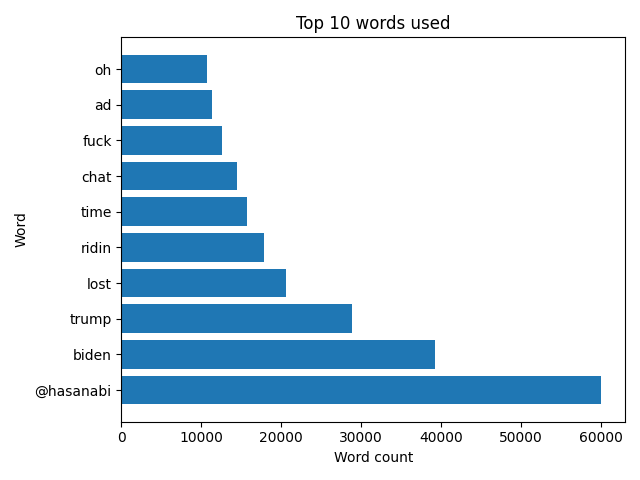
In this graph, I’ve listed the top 10 words used by users.
For reference, the @hasanabi word enables users to highlight their message in chat to the broadcaster.
The code below includes logic for collecting emote data before parsing. In this case, I wanted to filter out emote codes, so the graph only displayed legitimate words. Later, I will explain this process in more detail.
Here is the code to create this graph:
import json
import re
from collections import Counter

import matplotlib.pyplot as plt
import pandas as pd
import requests
from nltk.corpus import stopwords

df = pd.read_csv("./misc/chanlog.csv")


def fetch_emotes(url: str, id: str) -> str:
    try:
        resp = requests.get(f"{url}{id}")
        json = resp.json()
    except requests.exceptions.RequestException as e:
        print(e)

    return json


global_emotes = []

with open("global_emotes.txt", "r") as f:
    for line in f.readlines():
        line = line.replace("\n", "")
        global_emotes.append(line)


# https://twitchemotes.com/apidocs
data = fetch_emotes(url="https://api.twitchemotes.com/api/v4/channels/", id="207813352")

channel_emotes = [emote["code"] for emote in data["emotes"]]

# https://www.frankerfacez.com/developers
data = fetch_emotes(url="https://api.frankerfacez.com/v1/room/", id="hasanabi")

_set = str(data["room"]["set"])
frankerz_emotes = [emote["name"] for emote in data["sets"][_set]["emoticons"]]

# https://github.com/pajbot/pajbot/issues/495
data = fetch_emotes(url="https://api.betterttv.net/3/cached/users/twitch/", id="207813352")

betterttv_emotes = [emote["code"] for emote in data["channelEmotes"]]
betterttv_emotes += [emote["code"] for emote in data["sharedEmotes"]]

emotes = global_emotes + channel_emotes + frankerz_emotes + betterttv_emotes

STOPWORDS = set(stopwords.words('english'))

words = []

for msg in df["user_msg"]:
    msg = str(msg)
    msg = msg.split()

    for word in msg:
        if word not in emotes:
            word = word.lower()
            if word not in STOPWORDS:
                words.append(word)

words = dict(Counter(words).most_common(10))

x = list(words.keys())
y = list(words.values())

plt.barh(x, y)
plt.xlabel("Word count")
plt.ylabel("Word")
plt.title("Top 10 words used")
plt.tight_layout()
plt.savefig("top_words.png")
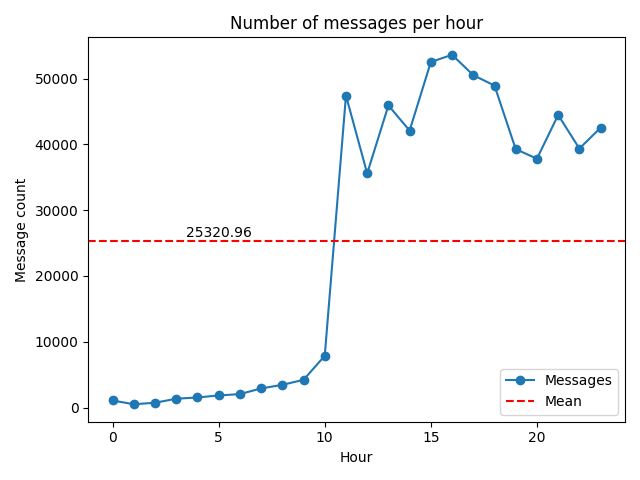
This graph shows the number of messages per hour between Nov 3, 2020, and Nov 4, 2020. We can see it’s a bit skewed because the live stream did not begin until 11:00 am PST.
Here is the code to create this graph:
import math
from statistics import mean

import matplotlib.pyplot as plt
import pandas as pd

df = pd.read_csv("./misc/chanlog.csv")

df["timestamp"] = pd.to_datetime(df["timestamp"])
df["hour"] = df["timestamp"].dt.hour

series = df.groupby(["hour"])["username"].count()

mean_val = mean(series)

plt.plot(series, marker="o")
plt.axhline(mean_val, color="red", linestyle="--")
plt.locator_params(axis="both", integer=True)
plt.xlabel("Hour")
plt.ylabel("Message count")
plt.title("Number of messages per hour")
plt.legend(labels=["Messages", "Mean"], loc=4)
plt.text(x=5, y=26000, s=f"{mean_val:.2f}", horizontalalignment="center")
plt.tight_layout()
plt.savefig("messages_per_hour.png")
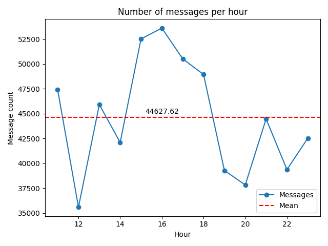
This is the same graph as the one above; however, the x-axis values are between 11 and 23, which is when the channel was live. In this case, the mean (red line) increases dramatically, which indicates how active the chatroom was during the live stream.
Interestingly, the chat room peaked at 4:00 pm PST, which is when the polls closed in Georgia, South Carolina, Virginia, Vermont, and parts of Florida.
The code below includes the modified lines:
import math
from statistics import mean

import matplotlib.pyplot as plt
import pandas as pd

df = pd.read_csv("./misc/chanlog.csv")

df["timestamp"] = pd.to_datetime(df["timestamp"])
df["hour"] = df["timestamp"].dt.hour

series = df.groupby(["hour"])["username"].count()
series = series[11:]

mean_val = mean(series)

plt.plot(series, marker="o")
plt.axhline(mean_val, color="red", linestyle="--")
plt.locator_params(axis="both", integer=True)
plt.xlabel("Hour")
plt.ylabel("Message count")
plt.title("Number of messages per hour")
plt.legend(labels=["Messages", "Mean"], loc=4)
plt.text(x=16, y=45000, s=f"{mean_val:.2f}", horizontalalignment="center")
plt.tight_layout()
plt.savefig("messages_per_hour_live.png")
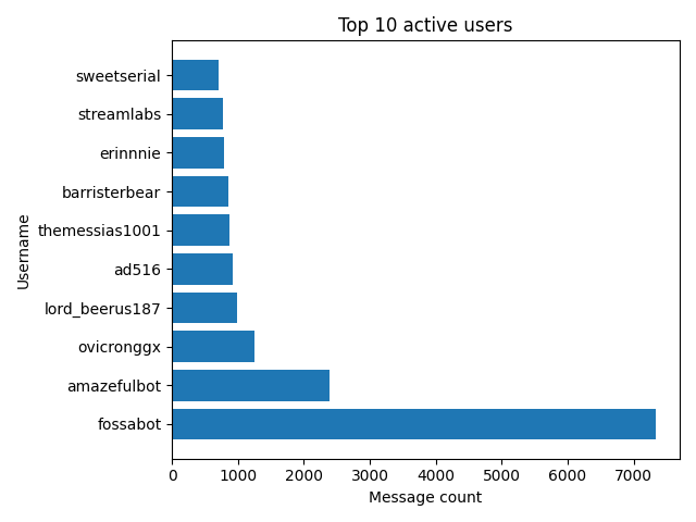
In this graph, we can see two chatroom bots took 1st and 2nd place. In other words, fossabot spammed users over 7,000 times!
Here is the code to create this graph:
from collections import Counter

import matplotlib.pyplot as plt
import pandas as pd

df = pd.read_csv("./misc/chanlog.csv")

c = Counter(df["username"]).most_common(10)

usernames = [item[0] for item in c]
messages = [item[1] for item in c]

plt.barh(usernames, messages)
plt.xlabel("Message count")
plt.ylabel("Username")
plt.title("Top 10 active users")
plt.tight_layout()
plt.savefig("top_users.png")
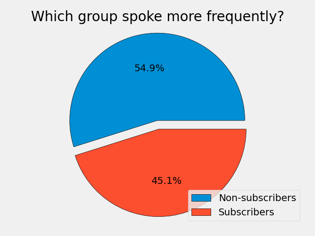
This pie chart shows the proportion of total messages that were sent by subscribers and non-subscribers.
Here is the code to create this pie chart:
import matplotlib.pyplot as plt
import pandas as pd

df = pd.read_csv("./misc/chanlog.csv")

nonsubs = df.loc[df["sub_count"] == 0]
subs = df.loc[df["sub_count"] > 0]

sizes = [len(nonsubs), len(subs)]

plt.style.use("fivethirtyeight")
plt.pie(sizes, autopct="%1.1f%%", explode=(0.1, 0), wedgeprops={"edgecolor": "black"})
plt.axis("equal")
plt.title("Which group spoke more frequently?")
plt.legend(labels=["Non-subscribers", "Subscribers"], loc=4)
plt.tight_layout()
plt.savefig("subs_vs_nonsubs.png")
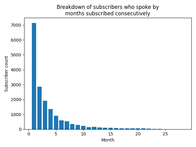
In this graph, subscribers are categorized into months subscribed consecutively.
Here is the code to create this graph:
import matplotlib.pyplot as plt
import pandas as pd

df = pd.read_csv("./misc/chanlog.csv")

subs = df.loc[df["sub_count"] > 0]
subs = subs.groupby(["sub_count"])["username"].nunique()

x = [i for i in range(1, len(subs) + 1)]
y = [val for val in subs]

plt.bar(x, y)
plt.xlabel("Month")
plt.ylabel("Subscriber count")
plt.title("Breakdown of subscribers who spoke by\nmonths subscribed consecutively")
plt.tight_layout()
plt.savefig("sub_breakdown.png")
Here is the classic word cloud.
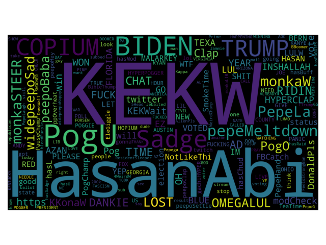
Of note, I set two parameters for the word cloud that are worth mentioning:
-
random_state=1- This will ensure the results are reproducible each time the graph is generated. -
collocations=False- This will remove duplicate words. For example, we would see “web”, “scraping”, and “web scraping” as a collocation if set toTrue.
Here is the code to create this graph:
import matplotlib.pyplot as plt
import pandas as pd
from wordcloud import STOPWORDS, WordCloud

df = pd.read_csv("./misc/chanlog.csv")

STOPWORDS = set(STOPWORDS)

words = ""

for msg in df["user_msg"]:
    msg = str(msg)
    tokens = msg.split()

    words += " ".join(tokens) + " "

wordcloud = WordCloud(width=1920, height=1080, background_color="black", random_state=1,
                      collocations=False, stopwords=STOPWORDS, min_font_size=12).generate(words)

plt.imshow(wordcloud)
plt.axis("off")
plt.tight_layout()
plt.savefig("word_cloud.png")
This list includes top links spammed by users in chat.
{
  "top_links": [
    {
      "overall": {
        "twitch.amazon.com/tp": 2093,
        "fossa.bot/l/blm-support": 228,
        "twitter.com/OsitaNwanevu": 88,
        "twitter.com/existentialfish/status/1323752032000450570": 79,
        "nytimes.com/interactive/2020/11/03/us/elections/forecast-president.html": 72,
        "discord.gg/hasan": 60,
        "twitter.com/ddayen": 59,
        "twitch.tv/HasanAbi": 56,
        "motherjones.com/politics/2020/10/meet-the-youtube-star-whos-pushing-a-generation-of-floridas-cuban-voters-to-trump/": 52,
        "app.com/elections/results/race/2020-11-03-state-house-GA-12271/": 46,
        "youtu.be/DujQ57JIckY?t=1400": 42,
        "twitter.com/KyleKulinski/status/1323699646712131586?s=19": 41,
        "twitter.com/ryangrim": 41,
        "youtube.com/watch?v=LgHn_VnTfeo": 38,
        "foxnews.com/elections/2020/general-results/probability-dials": 37,
        "reddit.com/r/KGBTR/comments/jn8pz4/denedik_bakal%C4%B1m_bir_%C5%9Feyler/": 35,
        "twitter.com/realDonaldTrump/status/1323864823680126977": 35,
        "foxnews.com/elections/2020/general-results": 32,
        "pittsburgh.cbslocal.com/2020/10/30/allegheny-county-ballots-not-returned/": 30,
        "instagram.com/hasandpiker": 29
      }
    },
    {
      "youtube": {
        "motherjones.com/politics/2020/10/meet-the-youtube-star-whos-pushing-a-generation-of-floridas-cuban-voters-to-trump/": 52,
        "youtube.com/watch?v=LgHn_VnTfeo": 38,
        "youtube.com/watch?v=Wbj5sDWluEA": 26,
        "youtube.com/c/hasanpiker": 21,
        "youtube.com/playlist?list=PLjecsWW92seZVGnwKQNVZ2n7yLNVKJe_D": 18,
        "youtube.com/watch?v=-cO1ZjkHfAs": 11,
        "youtube.com/watch?v=3eg23mdlhNI": 10,
        "youtube.com/watch?v=KkjxSKrcbOg": 9,
        "youtube.com/playlist?list=PLKnlxp7ZpNh5n7xqHJlVj8ZOHN-j87leI": 8,
        "youtube.com/watch?v=WiCaNBRAxQM": 7,
        "youtube.com/watch?v=dQw4w9WgXcQ": 7,
        "youtube.com/watch?v=Wbj5sDWluEA&ab_channel=YahooFinance": 7,
        "youtube.com/watch?v=R_FQU4KzN7A&t=3s": 6,
        "youtube.com/playlist?list=PLKAP7bXOPRQ7aKW58R3XOhwOQZWAcMDMQ": 6,
        "youtube.com/watch?v=W1ilCy6XrmI": 6,
        "youtube.com/watch?v=hNHKczIYqgA&ab_channel=NBCNews": 6,
        "youtube.com/watch?v=rudkz3QsfyM": 5,
        "youtube.com/watch?v=KkjxSKrcbOg&feature=push-lbss&attr_tag=_1n0yYfvLyhHNmoV%3A6&ab_channel=PowerfulJRE": 5,
        "youtube.com/watch?v=Yj-wc9qugGY": 4,
        "youtube.com/watch?v=wMALeR1i-FM": 4
      }
    },
    {
      "twitter": {
        "twitter.com/OsitaNwanevu": 88,
        "twitter.com/existentialfish/status/1323752032000450570": 79,
        "twitter.com/ddayen": 59,
        "twitter.com/KyleKulinski/status/1323699646712131586?s=19": 41,
        "twitter.com/ryangrim": 41,
        "twitter.com/realDonaldTrump/status/1323864823680126977": 35,
        "twitter.com/MollyMcKew/status/1323642367581310976": 29,
        "twitter.com/onikasgivenchy/status/1323857811734933504": 29,
        "twitter.com/JTHVerhovek/status/1323807207457173505": 26,
        "twitter.com/LEBassett/status/1323755538073686018": 24,
        "twitter.com/kenklippenstein/status/1323758018689966082": 23,
        "twitter.com/hasanthehun/status/1323506017271914502": 22,
        "twitter.com/benshapiro/status/1323890527767416834": 22,
        "twitter.com/KyleKulinski/status/1323699646712131586": 21,
        "twitter.com/VicBergerIV/status/1323527158816333824": 21,
        "twitter.com/kanyewest/status/1323727338387902465": 21,
        "twitter.com/boknowsnews/status/1323756354062950401?s=21": 21,
        "twitter.com/Phil_Lewis_/status/1323782399021490177?s=20": 21,
        "twitter.com/balleralert/status/1323305624214642693?s=20": 20,
        "twitter.com/kanyewest/status/1323855566314221568": 19
      }
    },
    {
      "reddit": {
        "reddit.com/r/KGBTR/comments/jn8pz4/denedik_bakal%C4%B1m_bir_%C5%9Feyler/": 35,
        "reddit.com/r/Hasan_Piker/comments/jn2vym/hasan_lookin_thicc_on_stream_tonight/": 12,
        "reddit.com/r/SpeedOfLobsters/comments/jn6p2a/when_you_pump_penis_and_want_to_gag/": 3
      }
    }
  ]
}
This one was challenging because URL parsing can be tricky. Currently, I have the following regex pattern to capture URL strings: (https?://(www.)?|www.)(?P<link>[^\s]+)
This works for the most part, but then I ran into edge cases like this: youtube.com
So, the regex pattern above would miss this particular example.
That said, I could use something like this: (?P<link>\w*.(com|net|org)([^\s]+))
However, this becomes cumbersome because now you have to manage the top-level domain group. Therefore, I didn’t want to go down that rabbit hole and ultimately used the first regex pattern instead.
For the record, most users posted links as https:// ... within the dataset.
Here is the code to list links spammed in chat:
import json
import re
from collections import Counter

import matplotlib.pyplot as plt
import pandas as pd

df = pd.read_csv("./misc/chanlog.csv")

overall = []
youtube = []
twitter = []
reddit = []

for msg in df["user_msg"]:
    msg = str(msg)
    data = re.search("(https?://(www.)?|www.)(?P<link>[^\s]+)", msg)

    if data:
        if re.search("(youtube)", data["link"]):
            youtube.append(data["link"])
        elif re.search("(twitter)", data["link"]):
            twitter.append(data["link"])
        elif re.search("(reddit)", data["link"]):
            reddit.append(data["link"])
        overall.append(data["link"])

overall = dict(Counter(overall).most_common(20))
youtube = dict(Counter(youtube).most_common(20))
twitter = dict(Counter(twitter).most_common(20))
reddit = dict(Counter(reddit).most_common(3))

with open("top_links.json", "w", encoding="utf-8") as f:
    json.dump({"top_links": [{"overall": overall}, {"youtube": youtube},
                             {"twitter": twitter}, {"reddit": reddit}]}, f, indent=2)
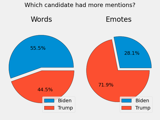
The pie chart on the left uses biden and trump words for each message, while the pie chart on the right uses emotes. For example, if a user types MALARKEY, it is usually a reference to Biden. You can view the actual emote here.
Of note, Biden only had one emote, while Trump had three. Thus, this may explain why the pie chart on the right is skewed a bit.
Here is the code to create these pie charts:
import matplotlib.pyplot as plt
import pandas as pd

df = pd.read_csv("./misc/chanlog.csv")

biden = 0
trump = 0

for msg in df["user_msg"]:
    msg = str(msg)
    msg = msg.lower().split()

    for word in msg:
        if "biden" in word:
            biden += 1
        # the TTrump emote should not be counted here
        elif "trump" in word and word != "ttrump":
            trump += 1

biden_emotes = 0
trump_emotes = 0

# include these emotes because their usage references biden or trump
_biden_emotes = ["MALARKEY"]
_trump_emotes = ["CHYNA", "DonaldPls", "TTrump"]

for msg in df["user_msg"]:
    msg = str(msg)
    msg = msg.split()

    for word in msg:
        if word in _biden_emotes:
            biden_emotes += 1
        elif word in _trump_emotes:
            trump_emotes += 1

sizes = [biden, trump]
sizes2 = [biden_emotes, trump_emotes]

plt.style.use('fivethirtyeight')

fig, (ax1, ax2) = plt.subplots(1, 2)
fig.suptitle("Which candidate had more mentions?")

ax1.pie(sizes, autopct="%1.1f%%", explode=(0.1, 0), wedgeprops={"edgecolor": "black"})
ax1.axis("equal")
ax1.title.set_text("Words")
ax1.legend(labels=["Biden", "Trump"], loc=4)

ax2.pie(sizes2, autopct="%1.1f%%", explode=(0.1, 0), wedgeprops={"edgecolor": "black"})
ax2.axis("equal")
ax2.title.set_text("Emotes")
ax2.legend(labels=["Biden", "Trump"], loc=4)

plt.tight_layout()
plt.savefig("biden_vs_trump.png")
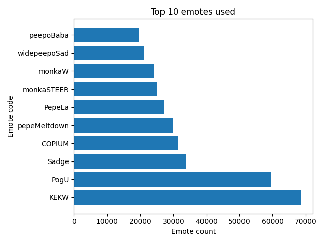
As mentioned earlier, there are global emotes, channel emotes, and 3rd party emotes available to users. Therefore, in order to capture all these emotes, I had to collect their emote codes using multiple sources and APIs.
For global emotes, I copied the following lists: Twitch, BetterTTV, and FrankerFaceZ. You can view the file here.
For channel emotes, I used Twitch Emotes API.
For 3rd party emotes, I used BetterTTV and FrankerFaceZ APIs.
With emote codes compiled into three lists, the code below looks for matching values, and if there is a match, places the emote value into another list (i.e., emotes). This final list is then passed into Python’s Counter to count the number of occurrences for each emote.
Here is the code to create this graph:
import json
import re
from collections import Counter

import matplotlib.pyplot as plt
import pandas as pd
import requests

df = pd.read_csv("./misc/chanlog.csv")


def fetch_emotes(url: str, id: str) -> str:
    try:
        resp = requests.get(f"{url}{id}")
        json = resp.json()
    except requests.exceptions.RequestException as e:
        print(e)

    return json


global_emotes = []

with open("global_emotes.txt", "r") as f:
    for line in f.readlines():
        line = line.replace("\n", "")
        global_emotes.append(line)


# https://twitchemotes.com/apidocs
data = fetch_emotes(url="https://api.twitchemotes.com/api/v4/channels/", id="207813352")

channel_emotes = [emote["code"] for emote in data["emotes"]]

# https://www.frankerfacez.com/developers
data = fetch_emotes(url="https://api.frankerfacez.com/v1/room/", id="hasanabi")

_set = str(data["room"]["set"])
frankerz_emotes = [emote["name"] for emote in data["sets"][_set]["emoticons"]]

# https://github.com/pajbot/pajbot/issues/495
data = fetch_emotes(url="https://api.betterttv.net/3/cached/users/twitch/", id="207813352")

betterttv_emotes = [emote["code"] for emote in data["channelEmotes"]]
betterttv_emotes += [emote["code"] for emote in data["sharedEmotes"]]

emotes = []

for msg in df["user_msg"]:
    msg = str(msg)
    msg = msg.split()

    for emote in msg:
        if emote in global_emotes or emote in channel_emotes or emote in frankerz_emotes or emote in betterttv_emotes:
            emotes.append(emote)

emotes = dict(Counter(emotes).most_common(10))

x = list(emotes.keys())
y = list(emotes.values())

plt.barh(x, y)
plt.xlabel("Emote count")
plt.ylabel("Emote code")
plt.title("Top 10 emotes used")
plt.tight_layout()
plt.savefig("top_emotes.png")
Because we’re analyzing data from election day, it only makes sense to see which states were mentioned the most by users.
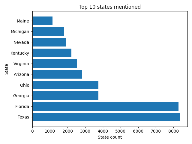
Here is the code to create this graph:
from collections import Counter

import matplotlib.pyplot as plt
import pandas as pd

df = pd.read_csv("./misc/chanlog.csv")

STATES = {
    "Alabama": "AL",
    "Alaska": "AK",
    "American Samoa": "AS",
    "Arizona": "AZ",
    "Arkansas": "AR",
    "California": "CA",
    "Colorado": "CO",
    "Connecticut": "CT",
    "Delaware": "DE",
    "District of Columbia": "DC",
    "Florida": "FL",
    "Georgia": "GA",
    "Guam": "GU",
    "Hawaii": "HI",
    "Idaho": "ID",
    "Illinois": "IL",
    "Indiana": "IN",
    "Iowa": "IA",
    "Kansas": "KS",
    "Kentucky": "KY",
    "Louisiana": "LA",
    "Maine": "ME",
    "Maryland": "MD",
    "Massachusetts": "MA",
    "Michigan": "MI",
    "Minnesota": "MN",
    "Mississippi": "MS",
    "Missouri": "MO",
    "Montana": "MT",
    "Nebraska": "NE",
    "Nevada": "NV",
    "New Hampshire": "NH",
    "New Jersey": "NJ",
    "New Mexico": "NM",
    "New York": "NY",
    "North Carolina": "NC",
    "North Dakota": "ND",
    "Northern Mariana Islands": "MP",
    "Ohio": "OH",
    "Oklahoma": "OK",
    "Oregon": "OR",
    "Pennsylvania": "PA",
    "Puerto Rico": "PR",
    "Rhode Island": "RI",
    "South Carolina": "SC",
    "South Dakota": "SD",
    "Tennessee": "TN",
    "Texas": "TX",
    "Utah": "UT",
    "Vermont": "VT",
    "Virgin Islands": "VI",
    "Virginia": "VA",
    "Washington": "WA",
    "West Virginia": "WV",
    "Wisconsin": "WI",
    "Wyoming": "WY"
}

states = []

for msg in df["user_msg"]:
    msg = str(msg)
    msg = msg.lower().split()

    for state in msg:
        state = state.title()
        if state in STATES.keys():
            states.append(state)

states = dict(Counter(states).most_common(10))

x = list(states.keys())
y = list(states.values())

plt.barh(x, y)
plt.xlabel("State count")
plt.ylabel("State")
plt.title("Top 10 states mentioned")
plt.tight_layout()
plt.savefig("top_states.png")
Conclusion
It was fun to explore and analyze this dataset at a surface level. That said, this post is a reminder that data exploration and profiling are necessary when it comes to data analysis, as these steps can lead to initial patterns and points of interest, which help piece together the “big picture.”
If you want to view the source code in its entirety, the repository is here.
Thanks for reading.